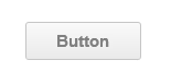
Button
■ Control appearance
■ Description
This control is a clickable button that displays a text string.
■ Events
The following table is a list of events that can be used with this control.
| Event name | Value | Description |
|---|---|---|
| !onValueChange | bool value |
This event occurs when the value of the control has changed. The value of value changes between true and false each time this event occurs. This event occurs when the button goes down and up. The value of value is output to the variable that is set as the Variable Link. |
■ Properties
The following table is a list of properties that can be used with this control.
For properties common to all controls, refer to the common items page.
| Property name | Default value | Description |
|---|---|---|
| Value | false | This property sets the status of the button. |
| Text | Button | This property sets the string that will be displayed. |
| TextColor | #808080 | This property sets the color that will be used for the displayed string. |
| Font | bold 15px Arial | This property sets the font that will be used for the displayed string. |
| FillStyleOn | {"style":0,"color1":"#FFFFFF"} | This property sets the fill method when the Value is 1. |
| FillStyleOff | {"style":1,"color1":"#FAFAFA","color2":"#EAEAEA","substyle":0} | This property sets the fill method when the Value is 0. |
| TooltipStr | "" | This property sets the string of the tool tip that will be displayed when the cursor is pointed. |
| bFireWhenValueChanged | false | This property sets whether or not to fire the event when the value property has been changed other than the control is pressed. |
■ Functions
The following table is a list of functions that can be used with this control.
The following functions can be used in the JavaScript entry area by entering the control ID or this + ".function name".
For functions common to all controls, refer to the common items page.
| Function name | Arguments | Return value | Description |
|---|---|---|---|
| setValue | value | - | This function sets the status of the button. Specify true or false in the value argument. |
| getValue | - | value | This function gets the value of the Value property. |
| setText | Text | - | This function sets the string that will be displayed. Specify the string in the Text argument. |
| getText | - | Text | This function gets the value of the Text property. |
| setColor | Color | - | This function sets the color that will be used for the displayed string. Specify the color as a string in the Color argument. |
| getColor | - | Color | This function gets the value of the TextColor property. |
| setFont | Font | - | This function sets the font that will be used for the displayed string. Specify the font as a string in the Font argument. |
| getFont | - | Font | This function gets the value of the Font property. |
| setTooltipStr | TooltipStr | - | This property sets the string of the tool tip that will be displayed. |
| getTooltipStr | - | TooltipStr | This property gets the string of the tool tip that will be displayed. |
■ Advanced properties
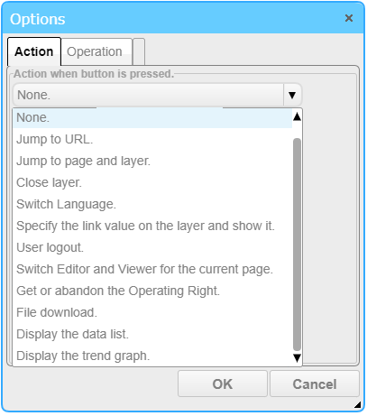
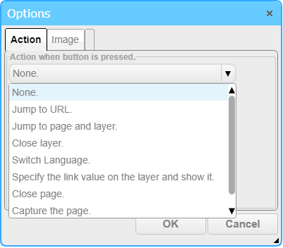
Select one of the following options.
□ None
The default action. No action will be executed.
□ Jump to URL.
This option is for an action that jumps to the specified URL.
You can select to open the destination in a new window or in the current window.
□ Jump to page and layer.
This option is for an action that jumps to the specified page or layer.
You can select to open the destination in a new window or in the current window.
Parameter: When jumping to the specified page, you can pass the entered value as a parameter. In the jumped page, the value is set to the link variable "param".
Template DeviceID from, DeviceID to view data: Specify the device ID to replace template device id used in the page.
Display thumbnail: Display the thumbnail of the page to jump on the button. If the text to be displayed in the tooltip is not set, the page name is displayed as the tooltip.
Keep thumbnail aspect ratio: When checked, holds the aspect ratio of the image used for the thumbnail.
□ Close layer.
This option hides the specified layer.
□ Specify the link value on the layer and show it.
Specify your own data link / initial value on the target layer and display it.
When you select this function, the "Link" tab is displayed and you can make settings.
□ Link
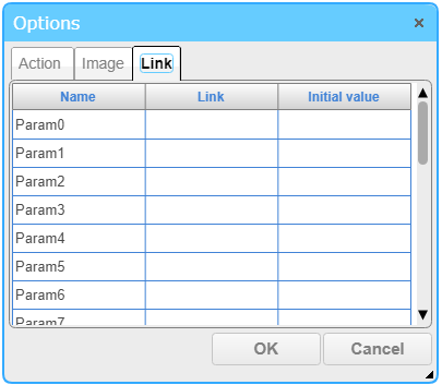
Link parameters can be assigned to ".ParamX" (X = 0 to 19) of the layer.
By setting ".ParamX" to the property link of the part placed on the target layer, you can change the value to be linked dynamically.
□ Usage example 1
(1) Add Layer1 to the page.
(2) Place a button on Layer0 and select "Specify Link to Layer" in "Action".
Select Layer1 in "LayerID" list.(3) From the Link tab, make settings as shown below.
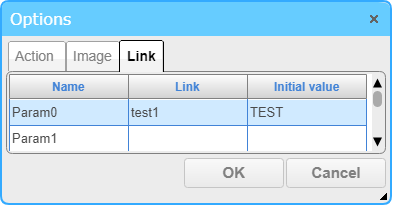
(4) Place a label on Layer1 and set ".Param0" to the link of "Text" property.

(5) When displaying Layer0 and clicking button, Layer1 is displayed and label display becomes "TEST".
□ Usage example 2
(1) Place the text input on layer 0 after setting Example 1.
(2) Set "test1" to the link of "Text" property of text input and "out" to I/O.
(3) Enter "TEST1" for text input.
(4) Clicking the button displays Layer and the label display becomes "TEST1".
□ Switch Language.
This option changes the display to the specified language ID.
□ User login.
This option is for an action that displays the login page.
□ User logout./ User login.
This option is for an action that logs out the user and then displays the login page.
□ Switch Editor and Viewer for the current page.
This option is for an action that jumps to the Viewer when the current page is in the editing environment.
It also jumps to the Editor when the current page is in the execution environment.
□ Get or abandon the Operating Right.
If you do not have the operation rights, you get it, if you have it you give up. For details, please refer to operation rights and log .
□ Download Files
This function is used to download files in Cloud. For file upload details, please refer to File List page.
□ Show Report
This function is used to show Report. For details, please refer to Report Screen page.
□ Show Trend Graph
This function is used to show Trend Graph. For details, please refer to Trend Graph Screen page.
□ Close Page.
This option closes the current page.
□ Capture the page
Capture the current oage as a png file, then download it. Note: The HTML frame, and Map componement can not be captured.
□ Act like a switch.
If this option is checked, the button acts like a switch, that is, when button is pressed, the Value is switched between 1 and 0.
□ Confirm input using buttons.
If enabled, the confirmation button and cancel button are displayed when the button is pressed. Use these buttons to confirm or cancel the input.
If "Act like a switch" is disabled, "Keep pushed state for specified time" is always enabled, and if an action is set, it is executed when the value is from True→False.
If "Act like a switch" is enabled and an action is set, the action is executed when the state changes.
□ Keep pushed state for the specified time.
When this check box is checked, when the button is pushed, it will keep the pushed state for the specified time.
This function is disabled if the "Act like a switch" checkbox is enabled.
□ time (seconds)
Set the time to keep the pushed state. The default value is 5 seconds.
■ Image settings
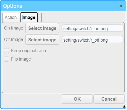
Specify an image file as the button face. The fill settings are disabled while the image is specified.
Available image formats are PNG, GIF, JPEG, BMP.
□ On Image
You can set the image displayed when the value is on (true). You can select an image from the file tree by pressing the "Select Image" button.
□ Off Image
You can set the image displayed when the value is off (false). You can select an image from the file tree by pressing the "Select Image" button.
□ Keep original image ratio
When enabled, the image ratio is maintained when the iamge is displayed.
If disabled, the image is displayed according to the size of the cell.
□ Flip image
Displays the image flipped horizontally.
■ Operation
In the operation setting, settings related to the operation log and operation rights are available. For details, please refer to operation rights and log .