Circle Graph
■ Control appearance
■ Description
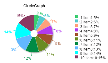
This control is used to display data in a circle graph. Up to 10 types of data can be displayed in the graph.
■ Events
This control has no events that can be used.
■ Properties
The following table is a list of properties that can be used with this control.
For properties common to all controls, refer to the common items page.
| Property name | Default value | Description |
|---|---|---|
| ValueX (X=1 to 10) | - | This property sets the data that will be displayed for itemX (X=1 to 10). Each item of data has its own properties. |
■ Functions
The following table is a list of functions that can be used with this control.
The following functions can be used in the JavaScript entry area by entering the control ID or this + ".function name".
For functions common to all controls, refer to the common items page.
| Function name | Arguments | Return value | Description |
|---|---|---|---|
| setValueX (X=1 to 10) | Value | - | This function sets the data that will be displayed for itemX (X=1 to 10). |
| getValueX (X=1 to 10) | - | Value | This function gets the value of the ValueX (X=1 to 10) property. |
■ Advanced properties
The advanced Circle Graph properties allow you to configure the details about the content that will be displayed.
■ General
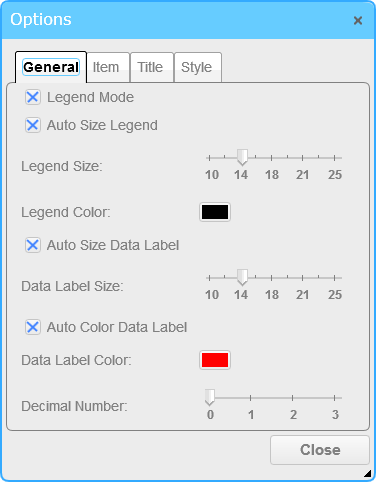
The General tab allows you to configure the legend and data display.
□ Legend Mode
When this option is enabled, the legend will be displayed. This option is enabled by default.
□ Auto Size Legend
When this option is enabled, the display size of the legend will be automatically adjusted. This option is enabled by default.
□ Legend Size
This option is used to display the legend with the set value when Auto Size Legend is disabled.
The default value is 14. The unit is pixels (px).
□ Legend Color
This option sets the display color of the legend. The default value is "black".
□ Auto Size Data Label
When this option is enabled, the display size of the data labels will be automatically adjusted. This option is enabled by default.
□ Data Label Size
This option is used to display the data label with the set value when Auto Size Data Labels is disabled.
The default value is 14. The unit is pixels (px).
□ Auto Color Data Label
When this option is enabled, the data label colors will be automatically adjusted to match the item colors. This option is enabled by default.
□ Data Label Color
This option sets the display color of the data label when Auto Adjust Data Label Color is disabled. The default value is "red".
□ Decimal Number
This option sets the precision for the value that will be displayed in the data label. The default value is 0 digits.
■ Item
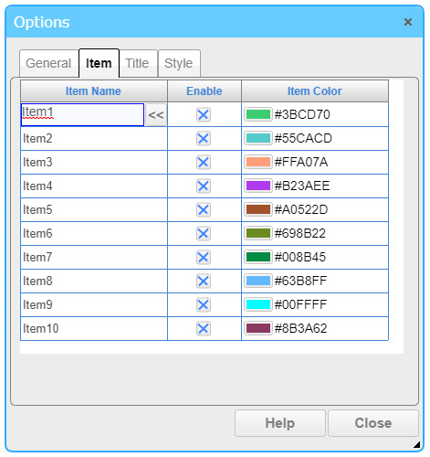
On the Item tab, you can configure the item name and drawing color by clicking the table cell.
□ Item Name
This option sets the name of the item.
You can press the << button, Editing Tool for Multiple Languages is started to edit and select the string that can be switched according to the displayed language.
□ Enable
Select the item to use. If disabled, the item is not used. By default, all items are enabled.
□ Item Color
This option sets the color used to draw the item on the graph.
■ Title
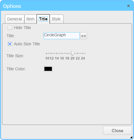
The Title tab allows you to configure the drawing method of the graph title.
□ Hide Title
When this option is enabled, the title is hidden. This option is disabled by default.
□ Title
This option sets the title of the graph that will be displayed. The default value is "CircleGraph".
You can press the << button, Editing Tool for Multiple Languages is started to edit and select the string that can be switched according to the displayed language.
□ Auto Size Title
When this option is enabled, the display size of the title will be automatically adjusted. This option is enabled by default.
□ Title Size
This option is used to display the title with the set value when Auto Size for Meter Title is disabled.
The default value is 20. The unit is pixels (px).
□ Title Color
This option sets the display color of the title. The default value is "black".
■ Style
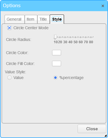
The Style tab allows you to configure the value and graph display.
□ Circle Center Mode
When this option is enabled, the circle graph will have a doughnut shape. This option is enabled by default.
□ Circle Radius
This option sets the radius of the circle that will be drawn in the center of the graph. The default value is "10". The unit is pixels (px).
□ Circle Color
This option sets the border line color of the circle that will be drawn in the center of the graph. The default value is "white".
□ Circle Fill Color
This option sets the fill color of the circle that will be drawn in the center of the graph. The default value is "white".
□ Value Style
This option sets the display method for the value. Select Value or %percentage. The default value is %percentage.