Label
■ Control appearance
■ Description
This control is used to display a string.
■ Events
The following table is a list of events that can be used with this control.
| Event name | Value | Description |
|---|---|---|
| !onTextFormat | string FormatedText |
This event occurs when the Text property of the control has changed. The value of FormatedText reflects the format that was set in the advanced properties of this control. |
■ Properties
The following table is a list of properties that can be used with this control.
For properties common to all controls, refer to the common items page.
| Property name | Default value | Description |
|---|---|---|
| Text | Label | This property sets the string that will be displayed. |
| Color | #808080 | This property sets the color that will be used for the displayed string. |
| Font | 14px Arial | This property sets the font that will be used for the displayed string. |
| AlignmentH | 1 (Left) | This property sets the horizontal alignment of the string. 1: Left, 2: Right, 16: Horizontal center |
| AlignmentV | 16 (Vertical center) | This property sets the vertical alignment of the string. 4: Top, 8: Bottom, 16: Vertical center |
| FillStyle | {"style":0,"color1":"transparent"} | This property sets the fill method when the Value is 1. |
| BorderColor | #DDDDDD | Set the border colo. |
| BorderWidth | 2 | Set the width of the border line in px (pixel). |
| BorderRadius | 4 | Set the radius of the border line in px (pixel). |
■ Functions
The following table is a list of functions that can be used with this control.
The following functions can be used in the JavaScript entry area by entering the control ID or this + ".function name".
For functions common to all controls, refer to the common items page.
| Function name | Arguments | Return value | Description |
|---|---|---|---|
| setValue | Text | - | This function sets the string that will be displayed. Specify the string in the Text argument. |
| getValue | - | Text | This function gets the value of the Text property. |
| setColor | Color | - | This function sets the color that will be used for the displayed string. Specify the color as a string in the Color argument. |
| getColor | - | Color | This function gets the value of the Color property. |
| setFont | Font | - | This function sets the font that will be used for the displayed string. Specify the font as a string in the Font argument. |
| getFont | - | Font | This function gets the value of the Font property. |
| setAlignmentH | Alignment | - | This function sets the horizontal alignment of the string. Specify the alignment method as a numeric value in the Alignment argument. 1: Left, 2: Right, 16: Horizontal center |
| getAlignmentH | - | Alignment | This function gets the value of the AlignmentH property. |
| setAlignmentV | Alignment | - | This function sets the vertical alignment of the string. Specify the alignment method as a numeric value in the Alignment argument. 4: Top, 8: Bottom, 16: Vertical center |
| getAlignmentV | - | Alignment | This function gets the value of the AlignmentV property. |
| setFillStyle | FillStyle | - |
This function sets the fillStyle. Specify the color as a string in the Color argument. |
| getFillStyle | - | FillStyle | This function gets the value of the FillStyle property. |
| setBorderColor | Color | - | Set the border color. Specify the color by the Color argument. |
| getBorderColor | - | Color | Get the color value of the BorderColor property. |
| setBorderWidth | Width | - | Set the width of the border line. Specify the width by the Width argument. |
| getBorderWidth | - | Width | Get the value of the BorderWidth property. |
| setBorderRadius | Radius | - | Set the radius of the border line. Specify the radius by the Radius argument. |
| getBorderRadius | - | Radius | Get the value of the BorderRadius property. |
■ Advanced properties
The advanced Label properties allow you to configure the format for displaying the control.
These settings do not affect the Text property, they only change what is displayed in the web browser.
Use the sample to check how the set format is displayed.
■ Standard
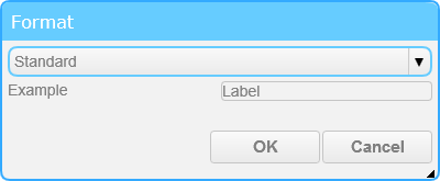
With the standard setting, the value of the Text property is displayed as is. This is the default setting.
■ Integer
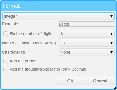
With the integer setting, the value of the Text property is displayed with the specified integer format.
□ Fix the number of digits
When this option is enabled, the number of digits for the integer is fixed to the selected value. The number of digits can be selected from 2 to 32.
□ Numerical base (Decimal etc)
This option is used to display the integer in the selected numeral system. The numeral system can be selected as base 2, 8, 10, or 16.
□ Character fill
This option selects the manner in which to fill empty space when the number of digits is fixed.
□ Add the prefix
When this option is enabled, a prefix that corresponds to the numeral system is added to the integer. (0b, 0o, 0x)
□ Add the thousand separator (only Decimal)
When this option is enabled, the integer is separated every three digits with a comma.
■ Float
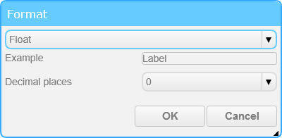
With the float setting, the value of the Text property is displayed with the specified float format.
□ Decimal places
This option is used to select the number of digits that will be displayed after the decimal point.
■ Date, time
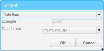
With the date and time setting, the value of the Text property is displayed with the specified date and time format.
The format can be converted when a string is assigned that can be handled as a date and time, such as "2016/01/01 12:34:56", or the number of milliseconds from 1970/01/01 00:00:00 (UTC) is assigned.
The format will also be converted using the current system time when a blank string is assigned.
□ Date format
This option selects the manner in which to display the date and time data.
■ Standard(Multiple lines)
With the standard (multiple lines) setting, the value of the Text property is displayed as it is. Multiple strings can be displayed.
■ Decoration
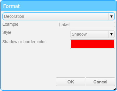
With the decoration setting, the shadow or border can be added to the text.
□ Style
This option selects the style of the text.
□ Shadow or border color
This option sets the color of the shadow or the border.
■ Scroll Text
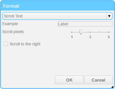
With the scroll text setting, scroll the text and display it.
□ Scroll pixels
This option sets the speed at which the text move.
□ Scroll to the right
This option sets the direction in which the text move. By default it moves to the left.
■ Elapsed Time
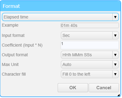
The elapsed time setting displays the value of the Text property in the specified time format.
□ Input format
You can select the unit of input value from seconds / milliseconds.
□ Coefficient (Input * N)
You can set the coefficient for the input value. As an example, if the input value is in minutes, you can convert to seconds by setting the factor to 60
□ Output format
You can select the format for output.
□ Max Unit
You can choose between automatic and fixed. In the case of automatic setting, the unit will be omitted if the time is less than the unit set in the output format.
Example of automatic setting: When the input value is 100 (seconds) and the output format is HHh MMm SSs, the output is 01m 40s.
□ Charactor fill
You can choose how to fill in the missing digits.